Monday, February 22, 2010

Making Money on YouTube

Nice work CBS, you must be raking in a pretty penny with your You Tube advertising!

So (yes - this is the point where I have to admit my awful viewing habits, I swear I don't like Survivor really) I was checking out the promo for Survivor Heroes vs. Villains but first up, check it out, I have to watch an ad for Sears:

It even has the "Advertisement: Your video will commence in 9 seconds" at the very very bottom.

If you look at the kind of stats that they're pulling in for the youtube channel too, they must be doing well:

CBS Profile
Channel Views: 8,368,933
Total Upload Videos: 596,793,625
Subscribers: 175,079

This is cleaver. I like it a lot. I do wonder how they charge for the advertising though. If the videos are loaded with the commercial, or if there is some way to serve the commercials. Very smart.

Back on the 14th of Feb this year, You Tube turned 5! Can you believe it? Only 5. A few articles have talked about how, while it was sold to Google in '06 for $1.65 billion, there hasn't been much money made from the site.

Yet I am sure that YouTube have been making some really smart advertising dollars. They must be making some money with the iTunes/eMusic purchase options. Right?
Of course now I can't find where I read that You Tube wasn't making as much coin as you would think. Maybe I imagined it. Has to be doing well.

Wednesday, February 17, 2010

Scare Tactics - Anti Drug ad

Wholly crazy anti-drug commercial batman!

I don't recall ever seeing this commercial. When was it on? It is amazing and intense and freaking well made.

So my last post was about negative consequences vs. positive reinforcement when it comes to social marketing messages, but I do believe that sometimes the negative consequences/scare tactics are appropriate.

Monday, February 15, 2010

Positive Reinforcement vs. Negative Consequences

So, my good friend HameDMC just sent me a tweet just before with a link to this ad:


Which is a pretty awesome ad from the UK which is AMAZINGLY shot. Quite beautiful for a road safety ad. Hamish's comment was:
It got me thinking about social marketing type messages in New Zealand and how we try to initiate behavioural change.

I think one of the more interesting recent switches from negative consequences to positive reinforcement is Water Safety New Zealand.

The previous Swim for Life message was 'If you don't learn to swim you're like a baby in the water' and this was the TVC:

I guess my issue with it is that not only is it called 'Helpless' but surely it would make the viewer feel helpless too if they are not a competent swimmer. I know that there is a call to action, but it would still be pretty tough making the call to get swimming lessons.

However their 2010 campaign is much more positive. I can't find it on You Tube, but you can find it here.

I like the way it addresses the problem and then gives a solution. It also focuses more on one audience (which must have been much nicer for the TV buyer) - parents. Get your kids to learn how to swim. Here are some reasons why you should get your kids used to the water. Here are some starting ideas. Much better.

Overall, I can understand the shock/scare tactic ads and I absolutely think that they have their place, but I think that when we are bombarded by these ads, they tend to lose their impact.

I'm a big believer in offering a solution when you tell people about a problem. While the scare tactics and negative consequences will show an audience what they don't want, it doesn't offer the viewer the alternative, or how not to get into the situation in the first place.

I'm interested if anyone else has any comment on this. What direction does a social marketing message need to take for you to notice, or change your behaviour? Or is it different for different behavioural changes?

Also, you should all support Hamish - he is doing Round the Bays, and you will all feel better if you donate and support the Heart Foundation.

Tuesday, February 9, 2010

Giving Girls a Bad Name

I know that the Fruju Whipped ad is supposed to be aimed at women, but all it does is frustrate me. Like females need any more of a bad rep.

Here are the 2 ads doing the rounds at the moment:


Now, following the weekend of AC/DC, where some psycho girl that was sitting near me bit her boyfriend so hard on the cheek it drew blood (I have no idea why) I find ads which make women out to be crazy chicks who control their partners seriously unappealing.

There are stereotypes and then there is just plain unfair. Girls aren't this bad right? Right? I mean, I watch girls drag their boyfriends around town, shopping with them and wonder what they were thinking. The guys are obviously bored out of their brains, but on the whole that must be as bad as it gets. But not all girls are like this. Not all girls force their boys to watch The Notebook.

Anyway, Fruju - its actually quite a nice ice cream, you're doing yourself not so many favours by making us girls out to be arseholes.

Friday, February 5, 2010

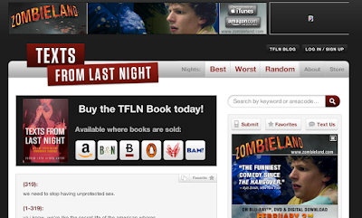
TFLN Making Coin from Twitter

Here's an interesting new twist on the monetisation of Twitter.

Why wait for Twitter to work out what it's going to do when you have 174,046 followers?

Sell your tweets! Why not? This is awesome.
Which clicks through to:
The multitude of reasons I love this:
  1. I know that there have been random sponsored links before, but this is the first one where I have seen an account be so up front about it
  2. TOTALLY looks like an endorsement - great for Zombieland
  3. TFLN hopefully got paid a pretty penny for this to look like an endorsement
  4. So incredibly relevant. I mean, I'm pretty sure that the TFLN crew are smart/savvy enough to know that they will lose credibility if they did a sponsored link for something shite, but this one is pretty bang on the money for their audience
  5. If @travilian can be responsible for the increase in consumption of Sir Breadwins cheese toasties with like 1,500 followers, what are 174,000 followers going to accomplish?
  6. Its an awesome add-on to their online advertising offer - which if you are a regular visitor to the site you will know that they advertise a lot of American Apparel, however this week:
Hot damn that all ties together quite beautifully.

Now - I don't have an iPhone, so I have not downloaded their app (I have put in a request for them to develop a Google app though) but I wonder if they are pushing Zombieland on the mobile app as well? Full integration.

Reason 7 this is awesome - Zombies are awesome.

Thursday, February 4, 2010

Email FAIL

Hi Frontier Touring Co.

I can't read this email. No. What should I do? You want me click here to view the email properly? OK. Will do.
Hmm. Not quite.
This is such a shame, Frontier Touring usually do their email shots so very well. Someone didn't have their ducks in a line for this one.

Check & check again people!

Tuesday, February 2, 2010

Wonky ad = visually horrible

Email came through today from StopPress. I really like StopPress, they have some good info, the email only comes out once a week, its all good. Until something visual ruins it like it did today.

Oh no!

Take a look. Does something not seem right about about the banner above the masthead? Because of how the Splore ad has been designed it completely screws with the visual effect. That nasty diagonal line makes it look like the banner drops to the right. I got out a ruler, it is a straight as a... ruler, but visually it is just so messy. In turn, it makes the masthead look messy and ruins the whole visual appeal of the email shot.
This might not be a big deal to everyone, as I know that I am very aware of aesthetics, but it really ruined the whole email for me.

The other part that gets me on this is that Splore will be AMAZING (kinda gutted I'm not going) so it is disappointing that whoever has been designing for them wasn't aware of how their design would translate.

Watch those angles kids - give me something that looks beautiful (or at least functional) and I will click on it.